Now that I've been wearing my LG G Watch R and testing it on a daily basis, it's time to express my opinions on the whole experience that is... Android Wear. It's not perfect, but it has huge potential. Here's why:
Look'n'Feel
I love the overall look of Android Wear's interface elements. Material Design is present and kicking it. You recognize instantly the shades, the flatness, the smooth transitions and animations. It's like a collection of Dribbble animated GIFs.
One thing to mention here, LG G Watch R may have a round screen, but it's only a "mask" applied to a square viewport. Regarding responsive design, the elements don't adjust to the circle's arcs, on contrary - they adapt to the 320x320 pixel container. You may lose sight of words or graphic elements when scrolling near the display's edges. Eventually you get used to it.
Navigation and interaction
Android Wear relies heavily on notifications, expressed nicely with cards. From weather, to health stats, mails, social media etc. The cards are accessible enough that most of the time I don't even need the phone - I simply read from the cards.
In terms of navigation you use Google Now which can become a bit frustrating. Yes, it's fast and efficient to reply or search something by voice, but getting to the apps I want to open is a bit too layered. I don't want to rely only on voice to navigate and when I don't, you have to tap around a lot to get to your app.
The Android Wear Apps
The App collections isn't as impressive as one may think, but it has its share of A-Listers. The only think that bother's me is I never know when the app is standalone or an extension of its parent phone app. Nonetheless, here are the apps I currently have installed (due to Android Wear's poor screenshot capabilities, all pictures are from the Google Play store gallery)
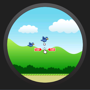
A Flappy Bird clone to pass the time and kill the boredom.
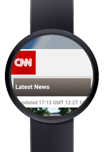
There is no Chrome, but there is a third party browser, where you can test your websites on Wear.
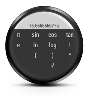
The perfect app to match that 80-90's feeling of a wrist calculator.
As much as like the default Heart sensor app from Google there is always something better. And Cardiograph is better.
A simple vertical endless running game.
Ever wanted to flip a coin in case of tough decision? Well now you can with just a tap away on your wrist.
Another Flappy Bird look-a-like but with a twist.
I use Evernote on a regular basis and it was a obvious choice to install it on Wear.
Google's default service - tap to make your phone ring when you can't find it.
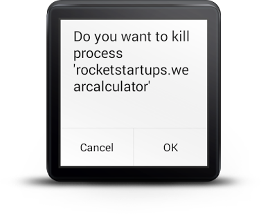
Navigation and App management is still clunky, but this little tool helps you close apps with much more efficiency.
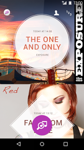
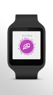
There's no Shazam... yet. The closest thing is TrackID - it works on the same principle.
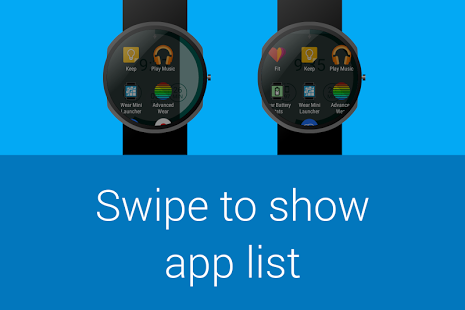
This is a MUST-HAVE. It makes app navigation light and easy. Mini Launcher should be on Android Wear by default.
A simple and fun game where you need to avoid collision.
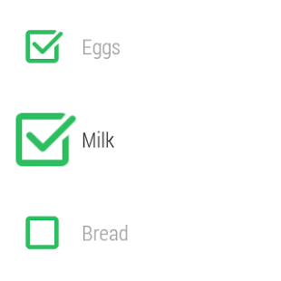
Besides Evernote and Trello, I also use Wunderlist for more goal-oriented tasks and I'm glad to have its features on Wear.
A Face for every style
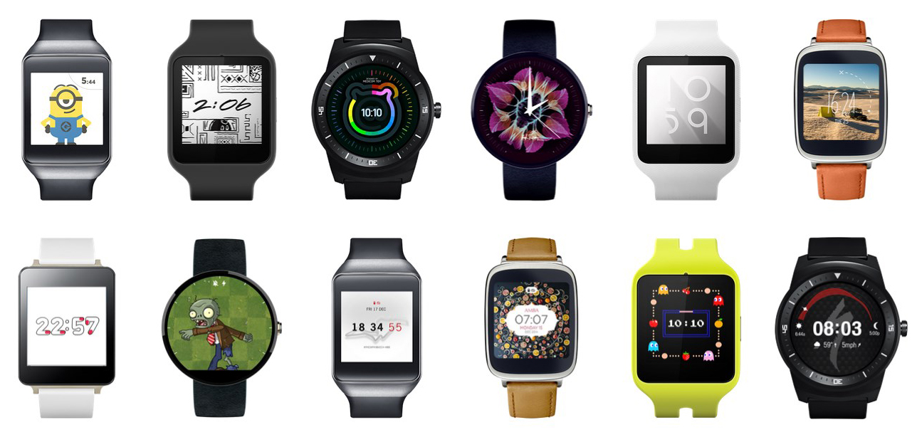
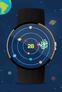
In my opinion the Faces are the main attraction for Android Wear. They are just plain gorgeous and blend naturally especially with the round screen. Of course there are some faces that makes you wonder "what were they thinking", but all-in-all the collection is vast and worth checking. I personally recommend those from ustwo, but I also switch to the following designs:
Performance
Performance wise, Android Wear does a pretty fair job, but along the way I did encounter several strange behaviors: from quick freezes, to app crashes, to the ultimate "Android wear is not responding". Indeed they are rare and less intrusive, but nonetheless, it still can annoy you.
Conclusions
Like I said, it's not complete, but it's on the right path. Wear has an upper advantage against the Apple Watch due to its early release, but that doesn't make up for the inconsistencies, bugs and limited functions. I am patiently waiting for the upcoming updates which will surely bring a boost in performance, looks and new features.
Final Rating ★★★☆☆
All my reviews feature a five-star rating system.
☆☆☆☆☆ - Better off buying a Shake Weight.
★☆☆☆☆ - Again, buying stuff I don't need.
★★☆☆☆ - Good... to give it as a gift.
★★★☆☆ - OKish. You won't regret it.
★★★★☆ - It's worth every penny!
★★★★★ - Awesomedary!
Subscribe to stay updated
I added a subscribe feature for you to get the latest news from the blog right on your inbox. It's based on Mailchimp's RSS campaigns, so on each Wednesday you'll receive an email with what's new on the blog (if new posts exist).
If you are interested, head over at pxdotpt.com/subscribe/ and register now.

