It was time for me to change my phone. Although I work heavily with the company device (currently Samsung Galaxy S3), my HTC Radar Windows Phone felt very clunky and outdated. I needed an upgrade and after carefully analyzing the specs of each OS (in terms of UI, interaction and experience of course) I decided to go with Google's Android 5.0 Lollipop, despite its close competitors iOS8 and WP 8.1.
I work with all OSs
My first true love will remain Windows Phone. I felt right away for the flat-tile-grid-based interface. I designed apps and games from the beginning using a LG E900 as reference, then switching to my own HTC Radar because I wanted so bad to qualify at the Imagine Cup Finals.
During this I also bought an iPod Touch 4G to keep up with the app industry (later on I switched to the latest model, 5G, to get the glamorous iOS7).
Moreover, to cover all major mobile players, I received a Samsung Galaxy S3 to use at work. The timing was just right as I didn't want to invest that much in mobile.
Images taken from their manufacturer's website
It's not all about the hardware
It's great to have the latest devices, but I'm not that person who invests a lot of money on a single phone. A maximum of 350 Euros should cover all my needs: looks, brains and speed. I do this mainly because their value drop fast in a year. What I do prefer and I consider it a "must" is to have the latest OS on it. For my new crush, Material Design, I went with a Nexus 5. Sorry iPhone 6, now is not your time.
Image taken from http://www.google.com/nexus/5/
My bet is on Lollipop
Let's start with the obvious reasons: Google's Material Design is fast, modern, clean, carefully tailored and crafted. It's personal, responsive and fluid. Is what Microsoft started with its "Metro UI" (back then) and what Apple tries to accomplish with iOS7/8. It's what interfaces should aim to look and behave starting with 2015.
It's not flat. It's material.
Material Design sets up a new standard in flatism. It adds an extra layer of detail such as shadows, subtle textures or the way it takes advantage of white space. Not only it looks good... it behaves good.
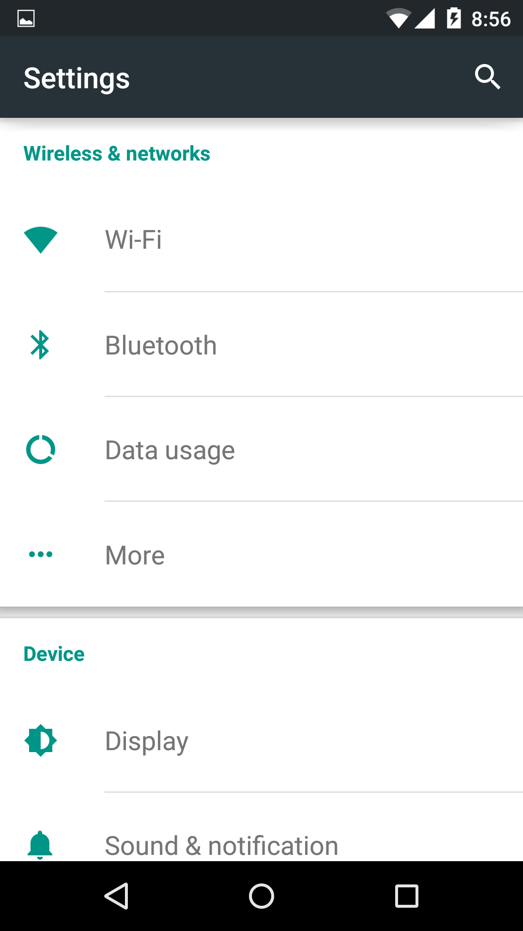
Here are some screens from my phone:
And to top it off, add a wise choice of typography, colors and iconography and Lollipop really brings up to front a personal experience.
Here are some more screens:
If you find it hard to believe me, just head over at Google's Design Guidelines and convince yourself.
Damn! Those animations!
Anything you touch it responds right back at you. You get quick feedback with each gesture using finessed animations that you can easily submit to Little Big Details. It doesn't overcrowd you with flashy, eye-popping movements, moreover it makes the UI feel part of the whole phone physical design.
You can check more animations at Android Police's blog post.
There will be more
Imagine taking this experience and extending it to wearables. And from what I've seen so far, I'm super hyped on Android Wear's potential, but with a twist. I'm keeping a close eye on Google Now. It really becomes too personal and that's scary (in terms of privacy).
From what it appears the community adopted Material Design really fast and even contributes on a regular basis. New tools rise with each day. Material Palette, Material Up or Material UI just to name a few.
Despite this, I don't know how casual or first-time users interact with Lollipop. Now that's an experiment worth trying.
I call Dibs!
It's all sugar coating what I said so far, but let's be honest: on desktop (notebooks included), Google has a really big disadvantage. It's far from close while Microsoft and Apple are taking the lead on reaching a unified working ecosystem. Maybe we will see some changes in the Chromebook department in the near future. Who knows.
The future looks promising
For now I picked a side; it's not permanent. The fact that Microsoft, Apple and Google are fighting each other to attract us, consumers, it's just fine and dandy. We will always have options to choose from and the best will always be there for us to discover.
That's not all, Folks!
I'm planning on buying my next wearable in the not-so-distant future. This will be a real headache to decide upon which one: go for Wear? go for a fitness tracker? maybe switch phones again for an Apple Watch? Time will tell, but first... let's research.


